10 Accessibility Mistakes Frontend Devs Make
Most accessibility issues aren't from ignoring accessibility — they're from a handful of habits that quietly break it without anyone noticing during development.
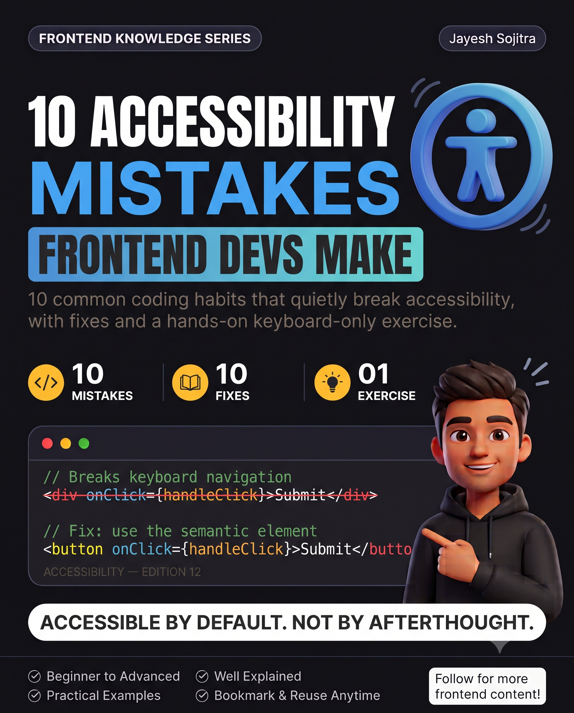
Accessibility often gets treated as a checklist to run at the end of a project, when most of the real issues come from small, everyday coding habits. Here are 10 that show up constantly, and how to fix each one.
1. Using <div> with onClick instead of <button>
// Breaks keyboard navigation and screen readers
<div onClick={handleClick}>Submit</div>

// Fix: use the semantic element
<button onClick={handleClick}>Submit</button>
A <div> isn't focusable by default and screen readers don't announce it as interactive. <button> gets keyboard support and correct semantics for free.
2. Images without meaningful alt text
// Screen reader announces nothing useful, or the filename
<img src="chart-q3.png" />

// Fix: describe what the image conveys
<img src="chart-q3.png" alt="Q3 revenue grew 18% quarter over quarter" />
For purely decorative images, use alt="" (empty, not missing) so screen readers skip it entirely instead of announcing the filename.
3. Color as the only signal
// A colorblind user can't distinguish red vs green here
<span style={{ color: 'red' }}>Error</span>
<span style={{ color: 'green' }}>Success</span>

// Fix: pair color with an icon or text label
<span style={{ color: 'red' }}>⚠ Error</span>
Roughly 1 in 12 men have some form of color vision deficiency — color-only signals genuinely exclude a meaningful share of users.
4. Form inputs without associated labels
// Screen reader can't connect the label to the input
<label>Email</label>
<input type="email" />

// Fix: connect them explicitly
<label htmlFor="email">Email</label>
<input id="email" type="email" />
Without the htmlFor/id connection, clicking the label doesn't focus the input, and screen readers can't announce what the field is for.
5. Missing focus indicators
/* Removes focus outline entirely — common but harmful */
:focus { outline: none; }
This is one of the most common accessibility regressions — usually added to "clean up" a default outline that clashed with a design, without providing any replacement. Keyboard users lose all visual indication of where they are on the page.
6. Modal dialogs that don't trap focus When a modal opens, keyboard focus should stay within it until it's closed — otherwise, tabbing can move focus to content hidden behind the modal, which is confusing for keyboard and screen reader users alike. Most component libraries (Radix, Headless UI) handle this correctly out of the box — a common mistake is building a custom modal without it.
7. Insufficient color contrast Light gray text on a white background might look clean, but if it fails WCAG contrast ratios (4.5:1 for normal text), it's genuinely hard to read for users with low vision, and often for everyone in bright sunlight on a phone screen.
8. Non-descriptive link text
// "Click here" tells a screen reader user nothing out of context
<a href="/report">Click here</a>

// Fix: descriptive link text
<a href="/report">View the Q3 financial report</a>
Screen reader users often navigate by pulling up a list of all links on a page — a page full of "click here" links is unusable that way.
9. Auto-playing content without pause controls Auto-playing video, carousels, or animations without an easy way to pause them can be disorienting for users with vestibular disorders or attention-related conditions, and is explicitly called out in WCAG guidelines.
10. Testing only with a mouse The most common root cause behind most of the above: never actually navigating your own app with just a keyboard (Tab, Enter, Escape) or a screen reader. Issues that are invisible with a mouse become obvious within minutes of trying either.
Try this yourself: unplug your mouse (or just don't use it) and try completing one core flow in your app — signing up, submitting a form, opening and closing a modal — using only Tab, Enter, and Escape. Note every point where you get stuck or lose track of where focus is. That's usually more revealing than any automated accessibility checker.
Takeaway: Most accessibility problems aren't ignorance of accessibility as a concept — they're specific, repeatable coding habits (div-as-button, missing labels, removed focus outlines) that break it quietly. Fixing these 10 covers a large share of real-world accessibility issues without needing to become an accessibility specialist first.